Skip to content
Brand & Experience

Web design and website redesign from our Manchester studio.

For businesses across the UK and internationally, we design new websites and rethink existing ones around clear content, useful journeys and responsive interfaces. Development can be included when the scope calls for it.

The context

A new website or redesign starts with what people need to do.

A website can look polished and still leave people unsure what the business offers or what to do next. We map those questions, the pages that answer them and the action each page should support before designing the interface.

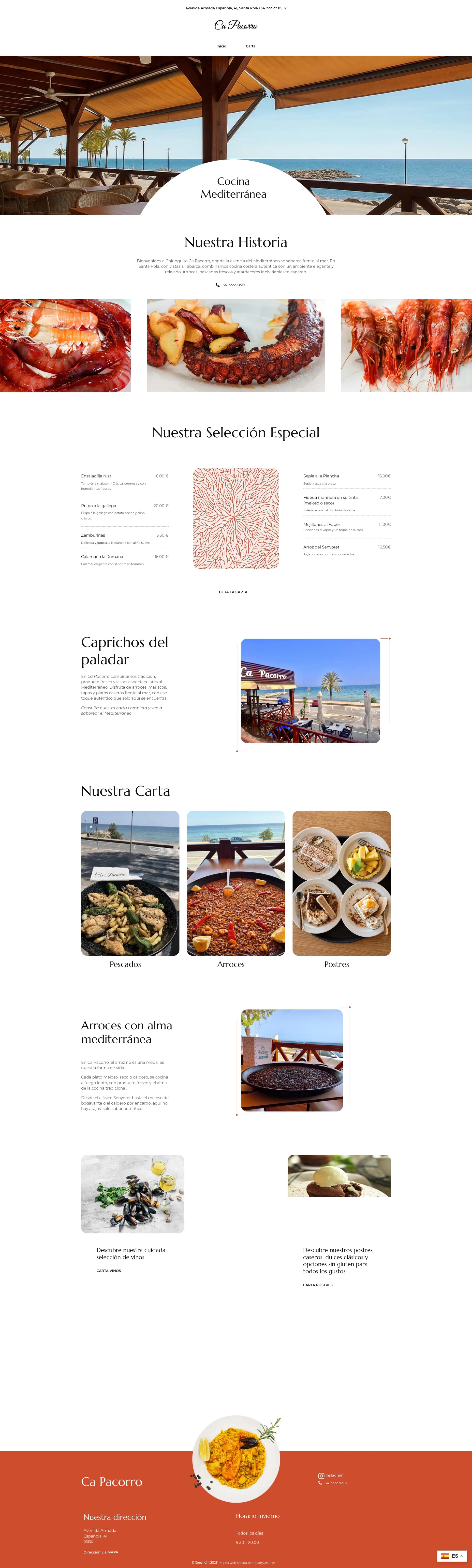
For a redesign, we review the current site to identify content, visual assets and URLs worth retaining, then plan the changes to navigation, page hierarchy and responsive behaviour. Ca Pacorro's restaurant website shows the role of photography, menu structure and mobile reading order in the finished experience.

When the scope includes implementation, connect the design with web development.

Capabilities

What the service covers

The work connects content, interaction and visual hierarchy from the first page structure through to responsive states.

  • 01UX and user journeys
  • 02Information architecture
  • 03Wireframes
  • 04Interface design
  • 05Responsive design
  • 06Brand-led visual systems
  • 07Accessibility considerations
  • 08Conversion-focused page structure
  • 09Website redesign planning
Project scope

What a project may include

The output is designed to give implementation clear decisions, not only attractive mock-ups.

  • 01Sitemap and page hierarchy
  • 02Priority user journeys
  • 03Responsive page designs
  • 04Reusable component states
  • 05Content and interaction guidance
  • 06Design handover or connected development
  • 07A plan for existing content and URLs where a redesign needs one
Planning the work

Web Design: planning the work

Give each page a job

A service page, product page and about page answer different questions. Before arranging blocks on a screen, we map what a visitor needs to know and what action makes sense next. This helps decide what belongs in the navigation, what deserves emphasis and where a form or call link should appear. It also reveals missing explanations that visual styling cannot solve.

Design the small screen deliberately

Mobile layouts need more than a compressed desktop design. Long headings, service comparisons, filters, forms and menus all change when space is limited. We work through priority tasks at narrow widths, including an open menu, a validation error or an empty result. This gives implementation a clear interaction model and reduces decisions that would otherwise be improvised late in development.

Connect the interface to real content

A design made only with short placeholder copy can collapse when real services or product names are added. Representative content helps identify which images and messages the business still needs to supply. Headings, calls to action and supporting proof are planned together so the page can explain the offer without relying on decoration. This is also where we decide what must be editable after launch.

Design systems and build handover

The output can include responsive layouts, component states, type and spacing rules, plus notes for forms, navigation and interactions. Those decisions can become reusable HTML and CSS components when development is part of the project. The build platform is chosen separately according to editing needs; a design does not require a particular CMS. Accessibility checks cover contrast, keyboard focus, touch targets and reading order before handover.

Project fit

Appropriate for

01

Businesses whose current website is difficult to understand or use

02

New websites that need structure before development begins

03

Ecommerce and product interfaces with important customer journeys

Approach

Decisions move from structure to interface.

The process makes the important journeys clear early, then develops a visual system that can hold them together.

  1. 01

    Frame

    Define audiences, tasks, content and the business action each page should support.

  2. 02

    Structure

    Map navigation, hierarchy and the main user journeys.

  3. 03

    Design

    Create responsive interfaces and reusable component patterns.

  4. 04

    Validate

    Review content, accessibility, edge cases and implementation requirements.

Connected capabilities
FAQ

Web Design: what to know before starting.

Does web design include development?

It can. Design can be scoped as a focused engagement or connected directly with web development so design and implementation decisions stay aligned.

Can the studio work with existing brand guidelines?

Yes. Existing identity rules can be translated into a clearer digital system, with gaps resolved where the website needs additional states or components.

Is accessibility considered during design?

Yes. Hierarchy, colour contrast, interaction states, keyboard use and responsive behaviour are considered before development and checked again in the build.

Do I need finished copy before design starts?

You do not need final wording for every page, but we need enough real information to understand the offer and key journeys. Missing content can be identified during structure work and agreed before final layouts are approved.

What happens to the design after approval?

It can move into development with the same studio or be handed to a build team. The agreed output should include responsive and interaction details so important choices do not disappear between design and implementation.

Start a project

Bring the requirement, even if the scope is not settled yet.

Share the business need, current system and practical constraints. The reply will suggest a useful next step.