A restaurant website for menu discovery and direct ordering.
Gyromania Greek needed its food, menu and ordering in one clear customer journey. Ready Creation designed and built the website for collection and local delivery.
The outcomeOne connected digital experience for the restaurant.
- Client
- Gyromania Greek
- Project type
- Restaurant & online ordering
- Year
- 2026
- Location
- St Helens, UK
Bringing the restaurant experience online.
For a local restaurant, the website has to do more than communicate atmosphere. It needs to help customers understand the food, explore the menu, find essential information and move naturally towards placing an order.
The project focused on creating a stronger digital presence for Gyromania Greek in St Helens while giving the restaurant a direct customer journey from discovery through to ordering on its own website.
Challenge
Represent the restaurant and its food while making the menu, practical information and direct ordering easy to find and use.
Approach
Ready Creation connected food-led website design, responsive development and an online menu with dish selection and an order basket on the restaurant's own website.
Objectives
- 01Represent the restaurant and its Greek food with a clear, confident digital presence.
- 02Help customers discover dishes, prices and practical visiting information.
- 03Connect the website to a direct ordering journey for collection and local delivery.
- 04Keep navigation and dish selection clear on desktop and mobile.
Scope
- 01Website design and digital experience
- 02Responsive web development
- 03Ecommerce and online restaurant ordering
- 04Menu categories, dish descriptions and pricing
- 05Dish selection and order basket
- 06Location, opening information and contact routes
Key decisions
Decisions that shaped the work.
01
Make the food the starting point
Restaurant and food photography introduce Gyromania before the visitor explores its menu. Prominent ordering actions connect that first impression to a practical next step.
02
Keep the menu and the order together
Category navigation, dish descriptions, prices and a basket bring browsing and selection into the restaurant’s own website rather than making customers piece the journey together elsewhere.
03
Design for the smaller screen
The mobile layout presents dishes in a single column, with category navigation and selection controls adapted to the available space.
How the approach became a real delivery.
Designed to make the food the focus.
The visual direction combines bold food photography, clear typography and generous layouts to give the restaurant a confident but approachable digital presence.
Content hierarchy centres on the information customers need: what Gyromania offers, popular dishes, menu discovery, opening information and clear routes into online ordering. The restaurant’s existing identity carries through the digital experience.
- Responsive restaurant website
- Food-led visual direction
- Clear content hierarchy
- Mobile-first ordering journeys
- Prominent calls to action
- Menu discovery
- Location and opening information
Built as a working restaurant platform, not just a brochure site.
The development extends beyond the marketing website. WordPress and WooCommerce underpin a customer-facing experience that connects restaurant content with an online menu, product selection and an order basket.
The menu presents product descriptions and prices alongside availability states, including dishes that are currently unavailable. Responsive development keeps the same content and ordering path accessible across desktop and mobile layouts.
Technology
- WordPress
- WooCommerce
From browsing the menu to placing an order.
A major part of the project was creating a direct ordering experience within the restaurant’s own website. Customers can browse dishes by category, search the menu, view descriptions and pricing, and build their order without leaving Gyromania’s website.
The experience supports the restaurant’s collection and local delivery offer, joining food discovery with the practical steps of choosing dishes and preparing an order.
- Menu categories and search
- Dish descriptions and prices
- Product availability
- Dish selection and basket
- Collection
- Local delivery
Designed around how restaurant customers actually order.
The mobile experience keeps menu navigation, product selection and ordering clear on smaller screens. A prominent ordering action on the homepage leads into a menu with category controls and individual dish cards.
The desktop layout places the basket beside the menu. On mobile, the narrower layout gives each dish room for its name, description, price and selection control without compressing the desktop grid.
One connected digital experience for the restaurant.
The finished platform brings Gyromania’s website, menu and direct ordering journey into one coherent experience. The project connects the restaurant’s visual presence with its practical need to help customers discover the food and order for collection or local delivery.
Ready Creation’s role spans website design, development and the online ordering experience, bringing the creative and technical sides of the project together.
Explore the capabilities behind this work.
Other relevant projects.
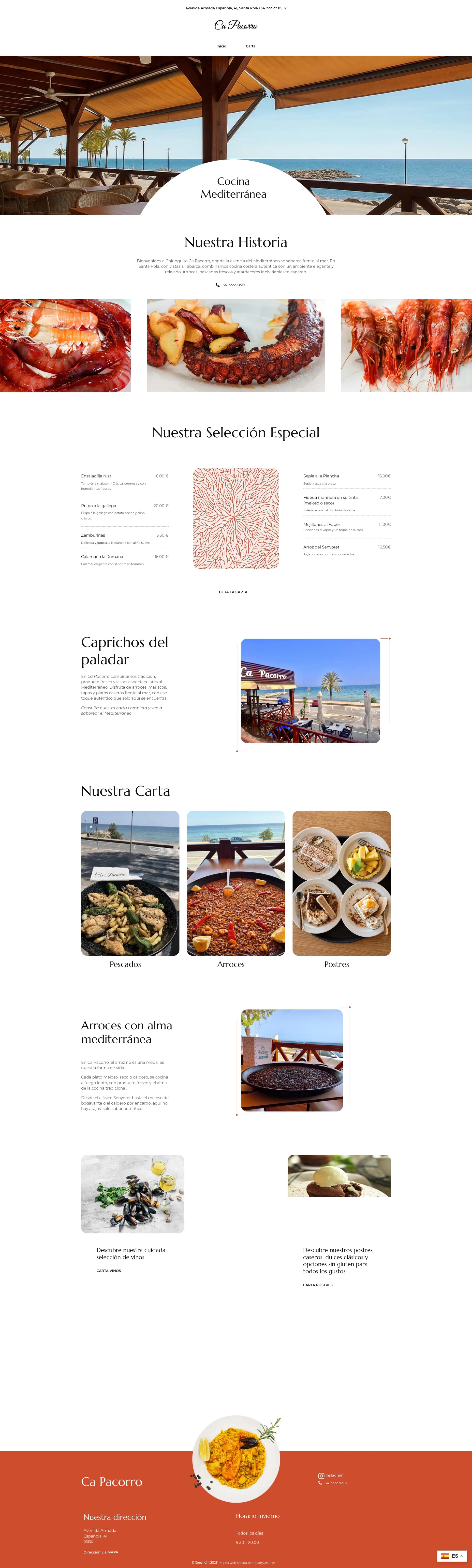
Ca Pacorro
Restaurant website design connecting Ca Pacorro’s Santa Pola seafront setting with selected dishes, menu categories and visitor information.
View case study
Fix & Shine
Website design, development and business cards connecting a Greater Manchester cleaning service with quote requests and direct contact.
View case studyNeed a website that has to do more than look good?
We design and develop digital experiences that connect the customer-facing website with the systems the business actually needs.
What happens next
- Tell us about the project
- We review the brief
- We arrange the next conversation