A workout product built around the next set.
SETR is Ready Creation’s internal workout-tracking product. We shaped its positioning, interface and front-end development around building routines, recording weights and returning to training.
The outcomeA deployed product from first explanation to repeat workout use.
- Project type
- Workout tracking product
- Year
- 2026
A product for the details people forget between sessions.
SETR is a workout-tracking product for building routines, recording sets, reps and load, and returning to previous performance during the next session.
The project needed to connect a clear public product story with account access and a repeat-use application, while keeping the interface practical on the phone a person is likely to carry around the gym.
Challenge
SETR needed to explain a focused workout tracking app quickly, helping gym users understand how to save routines, record weights, and follow progress set by set.
Approach
We built a sharp web app experience around the product promise, a strong fitness-led entry point, clear feature moments, and a direct path into account creation.
Objectives
- 01Make routine and workout logging quick to understand.
- 02Keep machines, previous performance, history and progress connected to each account.
- 03Join public product pages, account access and the signed-in experience in one coherent journey.
- 04Support repeat use across mobile and larger screens.
Scope
- 01Product positioning and information architecture
- 02Product UX and interface design
- 03Responsive product development
- 04Account access and saved workout journeys
- 05Responsive marketing and product experience
Key decisions
Decisions that shaped the work.
01
Keep the next action close to the workout
The signed-in experience centres routines, exercises and the current session so recording a set does not require moving through a reporting dashboard first.
02
Put previous performance in context
Earlier load and rep information sits alongside the current exercise, reducing the need to remember or search for what happened in the last session.
03
Connect acquisition and product access
Public pages explain the practical value, then lead directly to registration or sign-in rather than separating the marketing site from the application journey.
How the approach became a real delivery.
Designed around a recurring session, not a one-off visit.
The information architecture connects marketing pages, account access, routines, active workouts, history and progress. This gives new users enough context before account creation and returning users a direct route back into training.
Action hierarchy stays deliberately simple: choose or continue a routine, record the current exercise, then review history and progress when needed. Labels and controls are sized for use on smaller screens rather than treating mobile as a compressed desktop view.
The first screen explains the product in one practical promise.
A barbell photograph places the product in its gym context. The headline then names the two core actions: tracking sets and measuring progress. A short explanation connects those actions to routines and saved weights.
Muted olive, an off-white background and a compact tracker label keep the entry screen focused. A filled account-creation action and a quieter login action distinguish the first visit from the return visit.
A connected product experience from discovery to repeat use.
The public product story, account journey and workout experience are designed as one continuous service rather than separate website and application layers.
Registration, returning access, routines, active workouts, history and progress are coordinated around the actions a person needs before, during and after a training session.
The product journey is designed for the gym floor.
Navigation, forms, workout controls and history views adapt to compact screens with clear tap targets and a single-column action order. Larger layouts add space and context without changing the underlying workflow.
A clear entrance to a product used session after session.
The public entry introduces the workout tracker and presents account creation and login together. Inside the product, routines, workout logging, history and progress form the recurring training journey.
Ready Creation delivered product positioning, interface design and front-end development, connecting the explanation of the product with the actions it supports.
A deployed product from first explanation to repeat workout use.
The delivered application brings account access, saved routines, workout tracking, history and progress into one product. Its practical value is continuity: the workout record remains part of the next training session.
Explore the capabilities behind this work.
Other relevant projects.

Fix & Shine
Website design, development and business cards connecting a Greater Manchester cleaning service with quote requests and direct contact.
View case study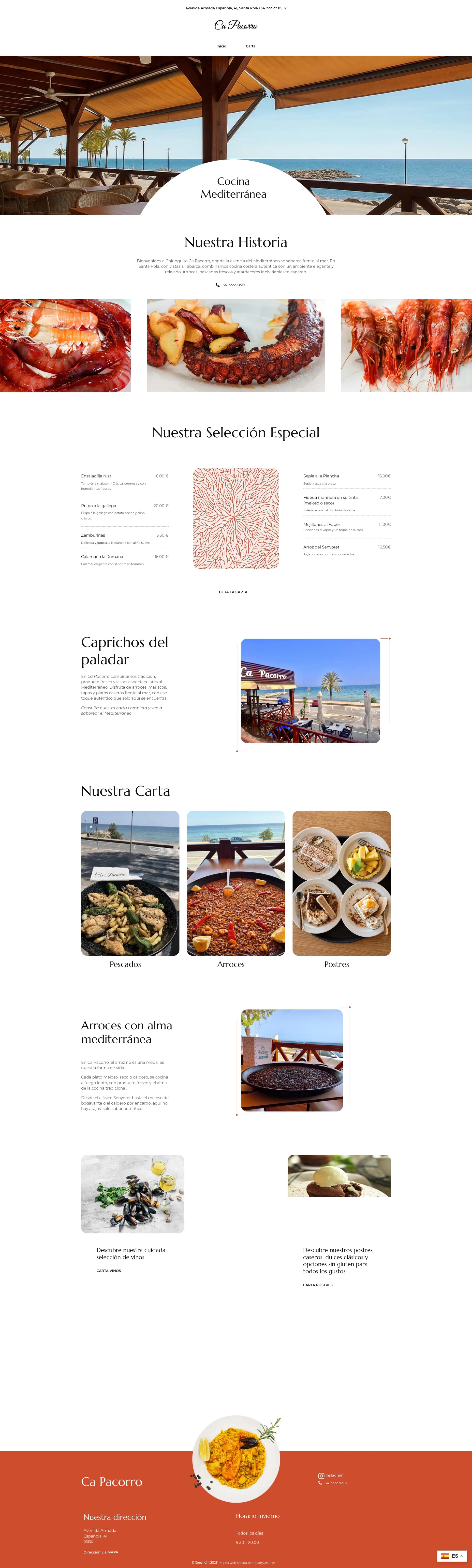
Ca Pacorro
Restaurant website design connecting Ca Pacorro’s Santa Pola seafront setting with selected dishes, menu categories and visitor information.
View case studyBuilding a product people need to return to?
Tell us what users need to do, what they need to remember and where the current journey gets in the way.
What happens next
- Tell us about the project
- We review the brief
- We arrange the next conversation